LOGO DESIGN
BadgePass
Objective: Redesign logo for BadgePass, Inc.
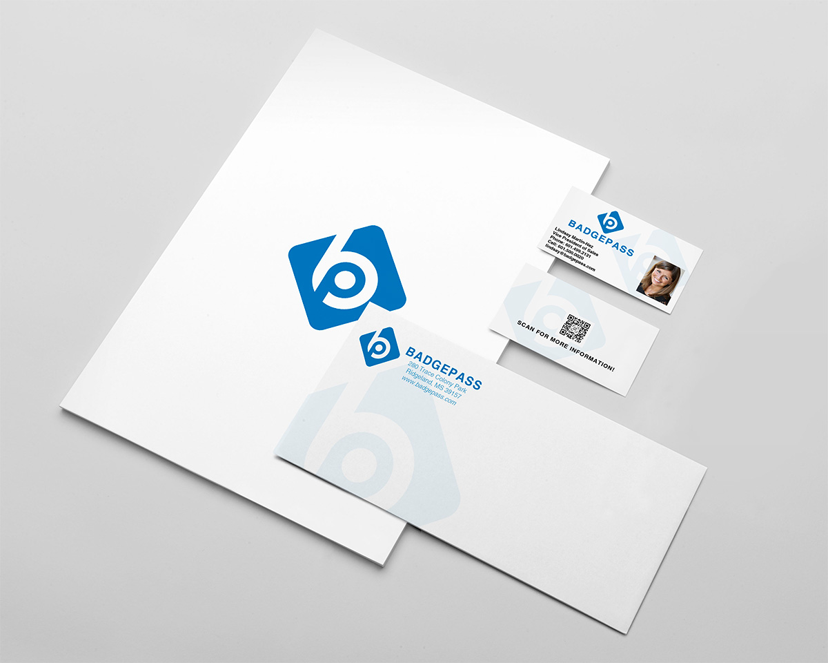
Approach: At the time the core idea to get expressed was that of BadgePass being the source, the power cell, behind a photo identification solution. First set of drafts and concepts leaned heavy into lightning/electricity and you can’t go wrong with a thunder bolt, but the concept fell flat and also resembled too much of Gatorade. Following concepts were that of a plug or battery composed within an identification card. I think a few of those concepts worked well, but we ultimately went with a more simplified design.
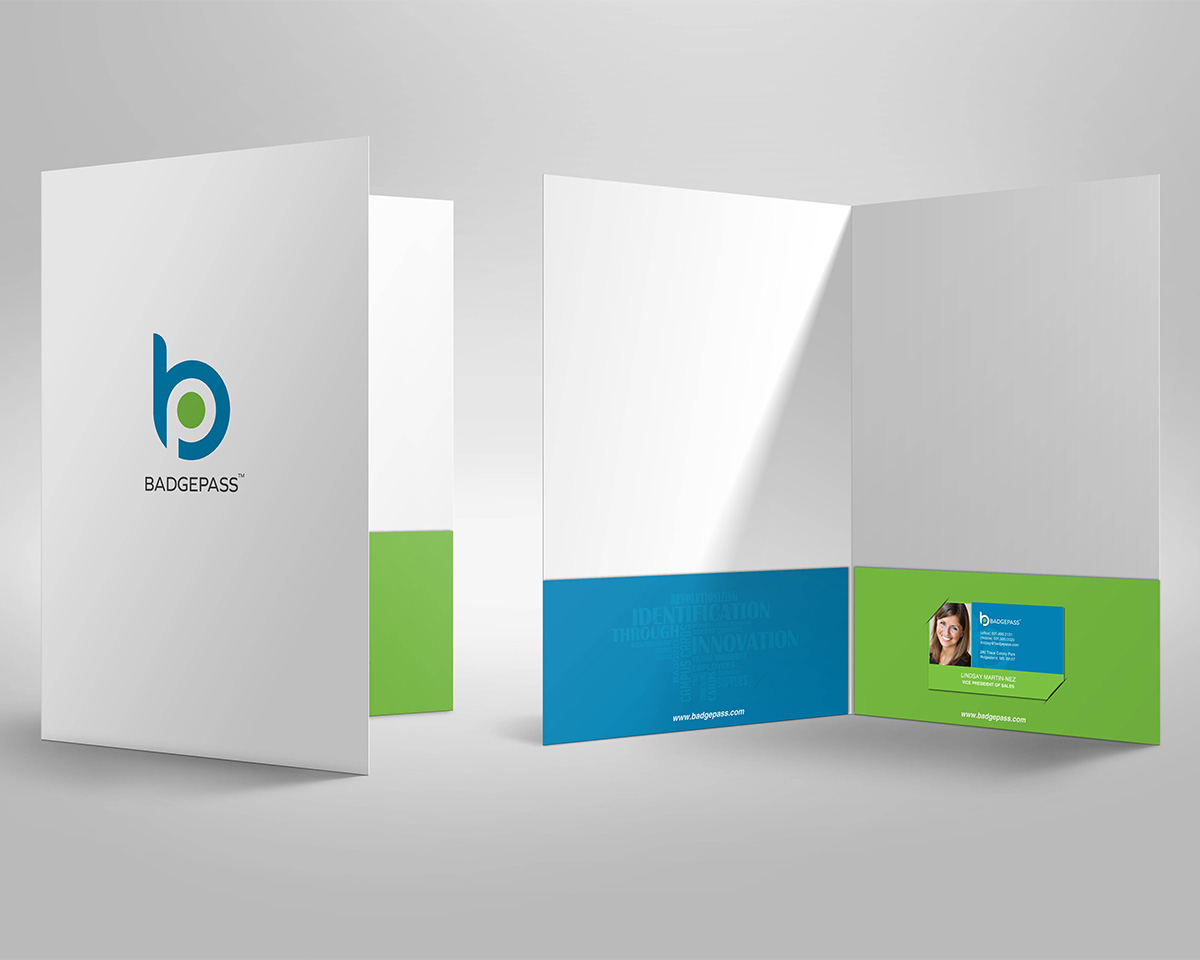
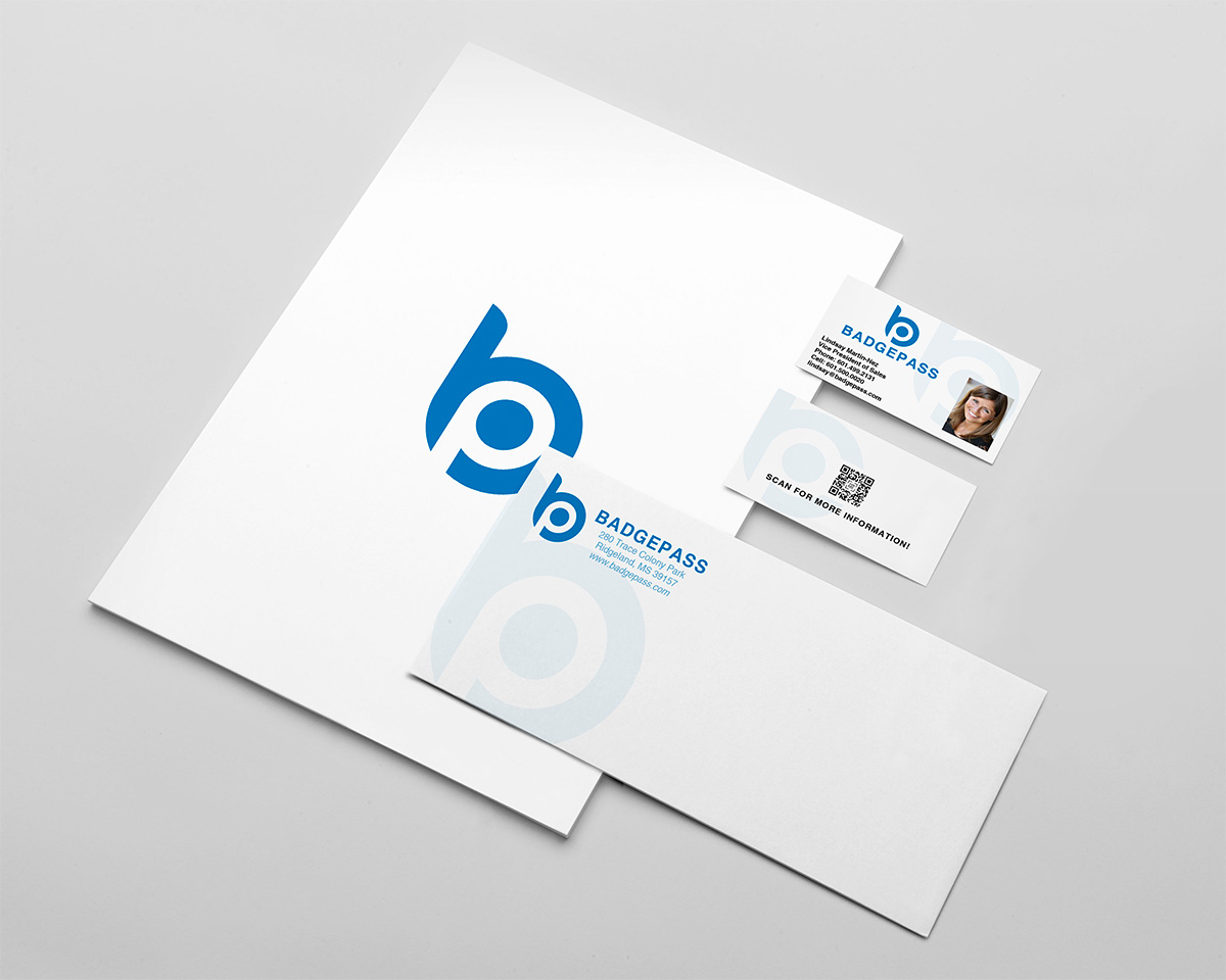
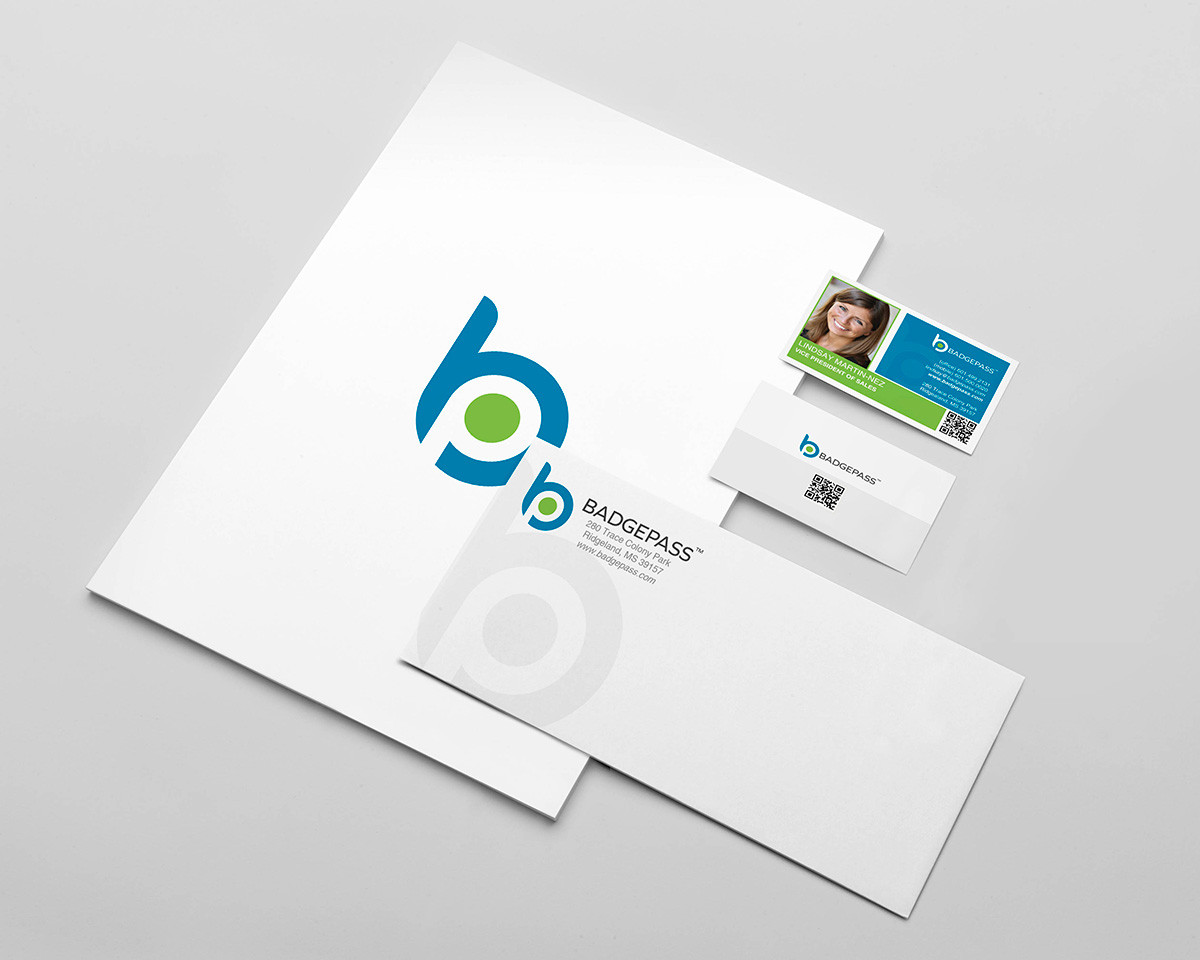
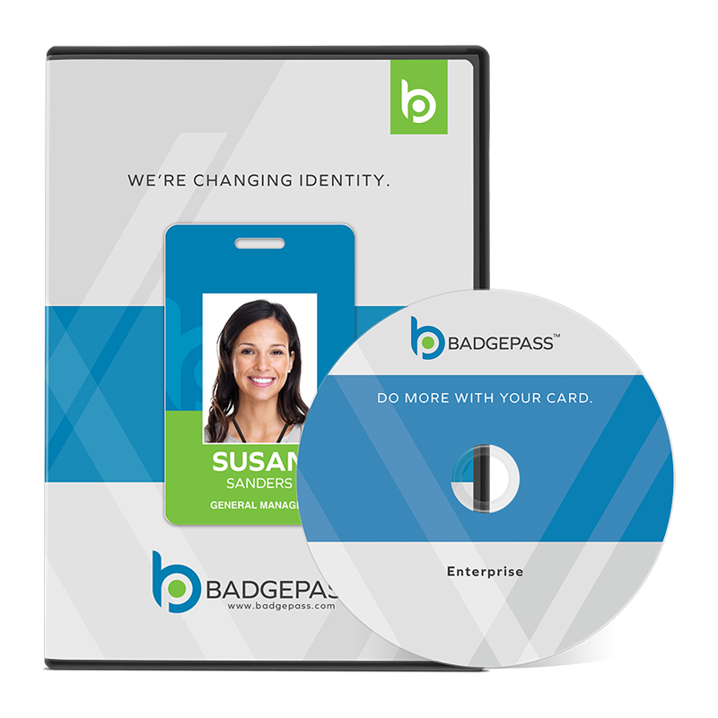
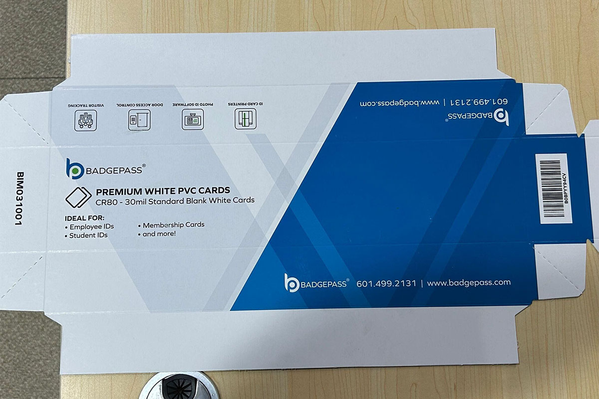
Results: The outcome was a straight forward logo of a “b” with the “p” being made up with negative space. We chose a more “true” blue color and kept the lime green – we had the most challenging time with the original blue printing with too much purple, in the past, which makes sense why it printed like that because the original blue was more of a navy blue.
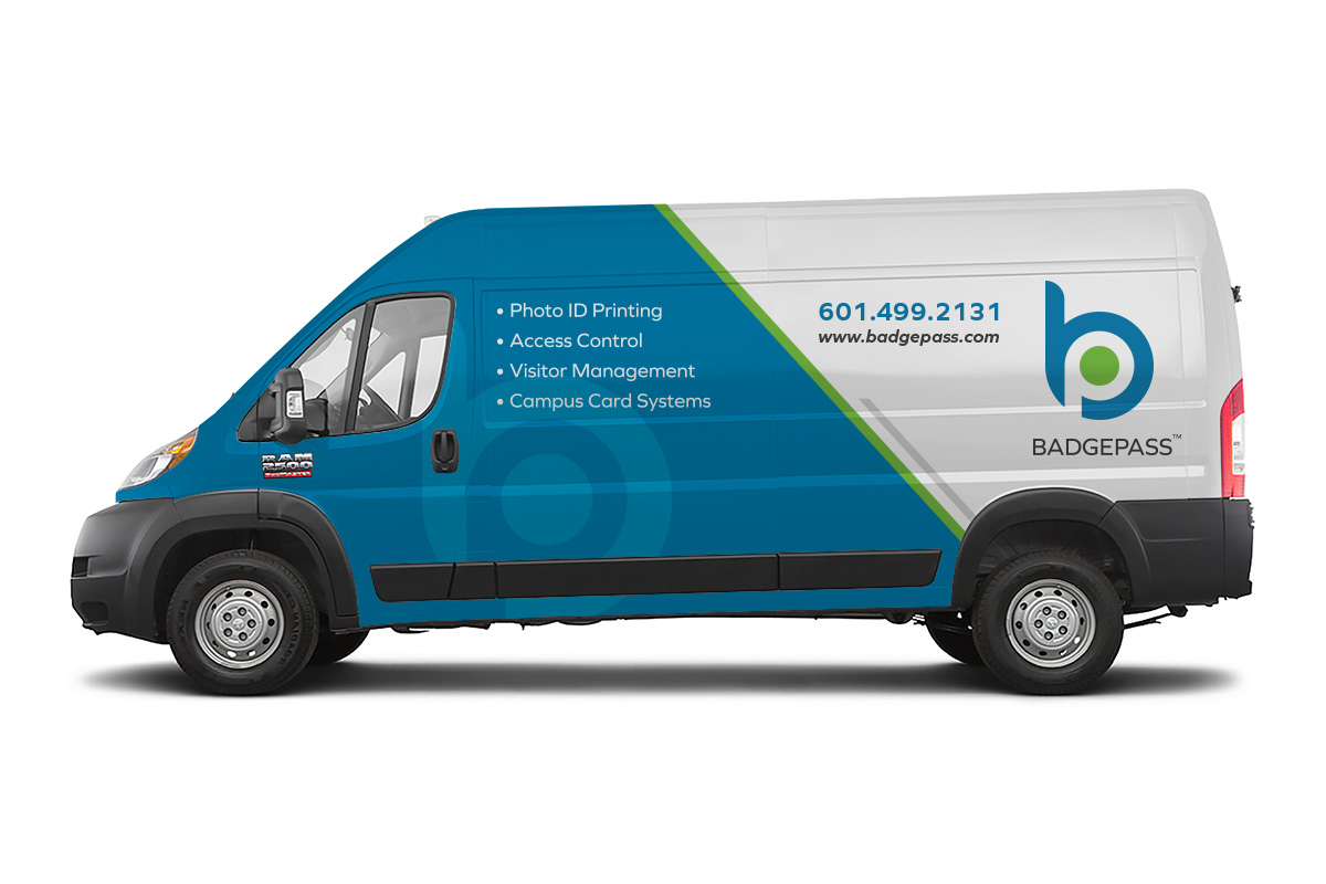
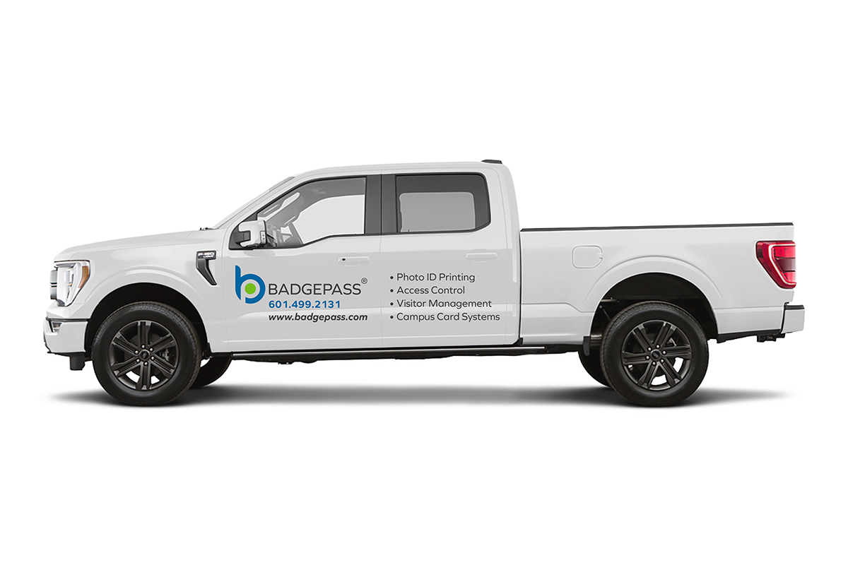
We use the logo everywhere. There are 2 versions of it – a horizontal logo and a “stacked” logo, but the horizontal logo is used 95% of the time.