LOGO DESIGN
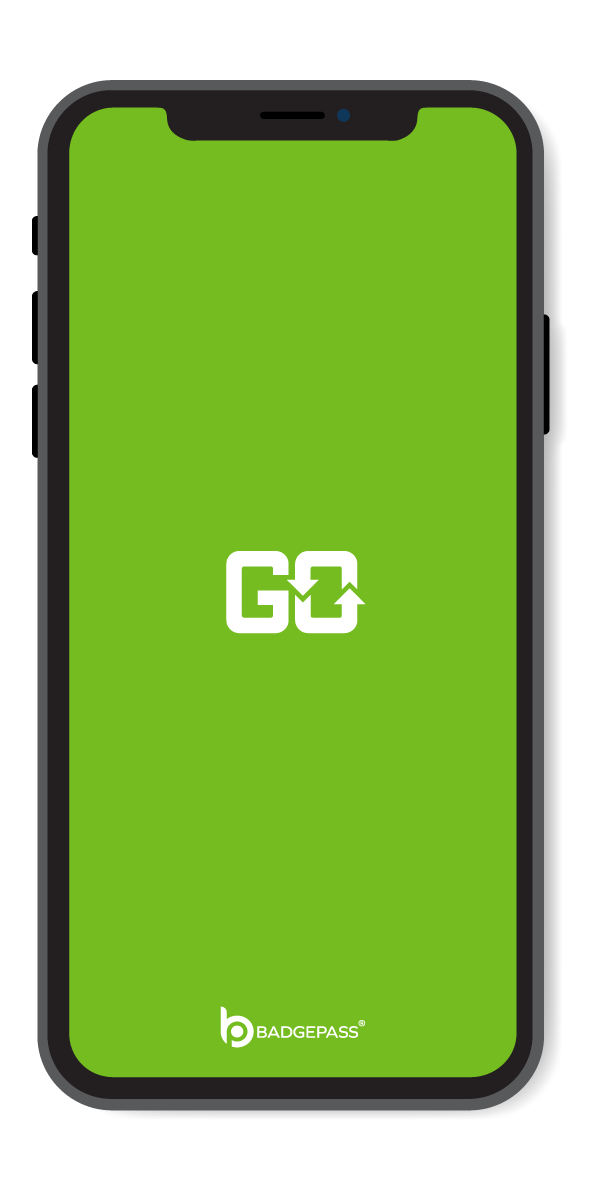
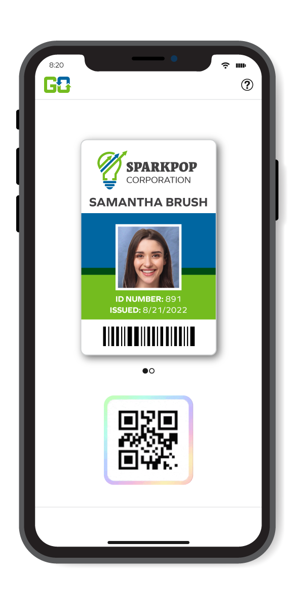
BadgePass GO
Objective: Create a logo for BadgePass’ newest application, BadgePass GO.
Approach: Initial concept was organic movement and direction, I wanted to create a design that flowed freely while seamlessly making up, or going with the curvature of the letters “G” and “O”, while also utilizing an arrowhead to point in a direction.
Results: Final design is a bold, blocky font with the movement being represented in the double arrow that makes up the “O”. Font and color schemes are to follow parent BadgePass logo.

